CLIENT: Lidl
Bakery Counter Refresh
Brief
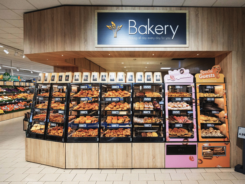
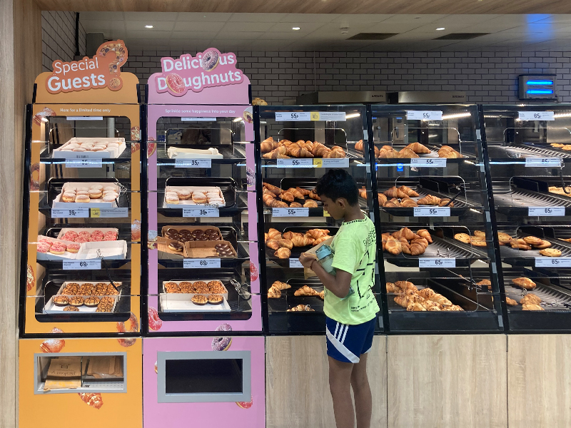
Create theatre and navigation through POS, to enhance new product ranges and draw customer’s attention in an area of the store which had previously had no promotional signage.
Execution
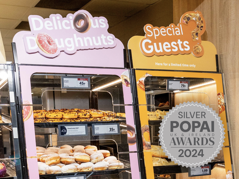
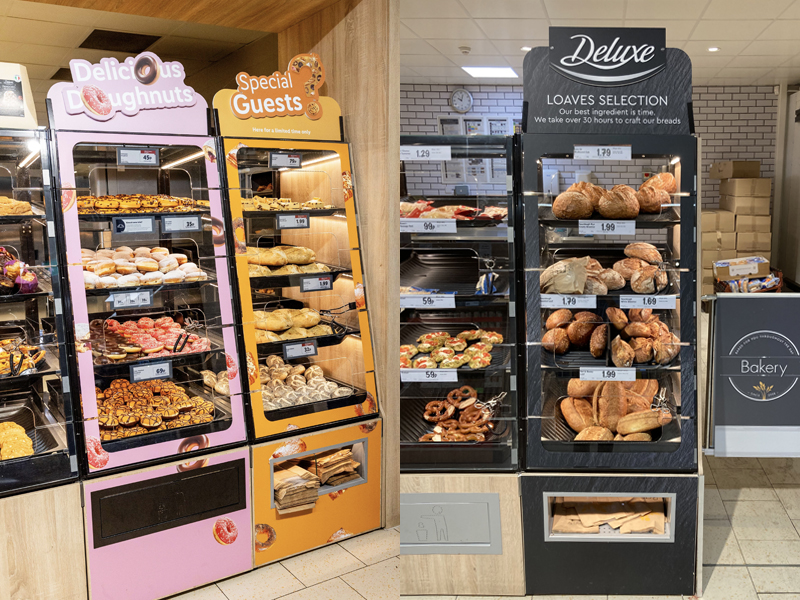
We created visually impactful and disruptive point of sale elements to aid recognition of their new range by developing a new solution to signpost and zone featured products. By utilising product imagery, this helped ensure the ranges were instantly recognisable in the busy bakery environment. The Doughnut pink links with a typical iced doughnut and allows customers to immediately see this is a sweet treat. Special guests golden orange/brown to show perfectly baked products and entice customers towards the bays.
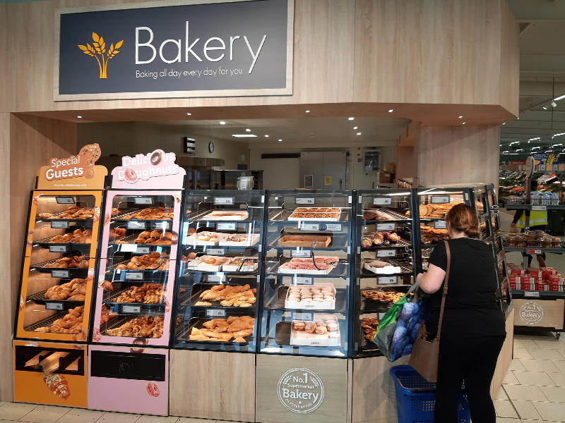
Designed to utilise existing fixtures and ensure both visual appeal and ease of shopping. Also, the ease of implementation and product restocking by store staff was crucial.
The successful launch has significantly enhanced the customer experience by making the bakery category easier to navigate and shop.

